My Green Lady

I grew up in the 70’s, an era known for its kitch and bad taste.  :-)

Tretchikoff’s the Green Lady.

My grandmother was an ardent admirer of the painter Vladimir Tretchikoff.  Several prints hung in her lounge (the Lost Orchid, Pink Lotus and others) but what most intrigued me was a picture book that she had of his work.  This book was an A3 size with full colour photo’s of his most popular paintings, including the ones that he did during his stint in the Orient.  A particular favourite of mine was the Green Lady – probably his most well-known piece.

I found the colours of her skin (green and blue with a touch of red) absolutely fascinating and would stare at the picture for hours.  My grandmother passed away in 2003 and the prints and the book were donated to the old age home where she spent her last years.  I forgot about it until a couple of years ago at a bookclub meeting with my friends.  A friend of mine, Cristelle, was into making  jewellery and brought some pieces to show us.  One of them was a laminated picture of the same Green Lady on a scrabble tile.  I was immediately drawn to it because of the memory of my grandmother but when I turned the tile over and saw that the letter on the back was “L” (the first letter of my name), the deal was clinched!  I bought the piece and it has since become a favourite of mine.

A year or so later I bought a book on the art of Tretchikoff and the full colour photo’s of the green Asian ladies so inspired me that I had to try it out.  But where to find a model?  The opportunity presented itself not long after.  During a training course at work, I spotted a colleague whom I had known for a couple of years and thought she would make the ideal model.  She had the most interesting face with beautiful traces of Asian influences.  An artist cannot be timid, so I boldly asked her if she would mind posing for the photos.  She generously agreed and became the model that I worked from.

First I did a layer using Sap Green, Titanium White and Payne’s Gray.  The latter was used for the shadows because it’s a beautiful dark blue without being too bright.  I didn’t use yellow on the face, preferring white.

At first I wanted to do the face in an impasto style which I did over the first layer.  The veil was done in red, burnt sienna for the shadows and red mixed with white for the highlights.

When I showed the painting to a friend, she commented that the skin was a bit too rough – it looked like the lady had bad skin…  Fortunately the paint was still fairly wet from the previous day and I could blend the skin quite easily.  I must admit that it looked a lot better after that.  I’m quite pleased with the final product.  The background was done in Ivory Black and white and I made it darker towards the bottom.  I put additional white next to the head when the painting was finished, to make it stand out more in contrast.

Some friends said it was a bit “weird” for their taste, but I like it.  At the moment I’m working on a second painting in the series.  Keep checking the blog for updates.

Please leave a comment.  I’m looking forward to your feedback.

Ready to Trade

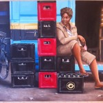
I started the second painting in the series of two for South African Breweries. 

Ready to trade - Final painting

I loved the setting of the woman looking back as if she’s looking for customers to come and buy beer for the weekend!  I also liked the red beer crates and the interest that the bicycle brings to the picture.

Original photo

I started with filling in the background first and spent quite a lot of time getting the container right.  Because it is a man-made object, and the style of painting is photo-realism, it is imperative that the lines are straight.  Skewed or wobbly lines would throw out the observer’s eyes immediately. 

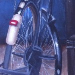
The bicycle was a challenge.  It was important to get all the bits of it correct so that it looks real.  I filled in the major parts of it first to ensure that it was anchored to the canvas.  I must admit that I “made up” some of the details because it had a weird shape.  Then I did the background with two layers and finished it before tackling the bicycle again.  The details on the bicycle were the last thing to do. 

Close up of bicycle


The background behind the bicycle really competed with the bicycle and I wanted the bicycle to stand out much more – after the woman it was the second focus point of the painting.  So, I used a very thin wash of Black and turps and brushed over the background.  That ensured that the detail was still visible, but it became darker and receded into the background.  I thought that worked really well.

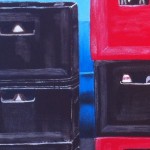
The beer crates got two layers of Burnt Umber and Primary Red straight from the tube.  I dry-brushed the highlights in white over it and included the imperfections to make it look real.

Close-up of beer crate

The woman’s skin was done in Burnt Umber, Flesh and Burnt Sienna.  Again, the Burnt Sienna is crucial in giving her a “warm” and “human” look.  I built up the flesh layer by layer – there are a total of 4 layers on the skin.  The highlights were done last with a light coloured flesh and finally white as a super highlight.

Close up of face

The clothes were a bit daunting.  In the end I decided not to include every little detail and really focused on getting the shape of the material correct.  To get the khaki colour, I used Burnt Umber and White, but added a little bit of flesh to ensure that it didn’t look too dull.

The background inside the crate was done in pure black with some detail of the shelves.  I ensured that the detail receded into the background by blending the colours well, in order to achieve the right perspective.  The bottle on the shelf was interesting so I added it.

The foreground was done in Burnt Umber, Yellow Ochre and White and I had to keep on lightening it.  I added some leaves so that the ground doesn’t look too plain and broke it up by adding lighter and darker sections, suggesting pebbles.

Close up of feet and crates

The shadows on the ground were important to get right and I ensured that the woman, the crate and the bicycle had clear shadows to anchor them to the scene.

Lastly I added the scuffed detail on the container and ensured that the lines aren’t too straight – notice the broken line between the yellow and the black paint.  There’s also red paint on the black areas.

Close up of container

I think this has come out very well and I’m very proud of it!  Your comments are welcome.

Supporting SA’s finest

Completed painting

Being a fledgling artist (!) I have been sharing my painting experiences with friends and colleagues alike over the last year or so.  Great was my pleasure when a colleague asked me to paint two works to hang in the corporate university of one of the biggest breweries in South Africa – SAB.  I was overjoyed that my work will be displayed in a public place for the first time.  Woohoo!

I immediately set out looking for suitable photographs as an inspiration.  I found a couple of great photographs taken for SABMiller (the holding company) by a photographer called (OneRedEye) and obtained permission to use them. This is the original photo for the first of two paintings.

Original photo

I titled the first picture ‘Supporting South Africa’s finest’ – because it shows both our national soccer team’s colour as well as the best-knows beer brand, Castle Lager.  The Soccer World Cup was hosted by South Africa in 2010 and it was a BIG DEAL!  The country really rallied around our soccer team and everyone was in the grip of national patriotism – something that is fairly rare in a country where poverty and crime are two biggest issues.  For a couple of weeks the whole country pulled together towards a common goal, and by all accounts hosted the World Cup in an exemplary way.

I started the painting on a 24 x 30 inch canvas.  The focus points were great – I liked the contrast of the yellow t-shirts to the blue background of the shipping crate, and the man on the right added life to what could otherwise been a very ‘dead’ picture.

I started with the shirts and used Zelcol’s Chrome Oxide green, with shadows done by mixing the green with Payne’s Grey.  The light yellow shirts were done in yellow and white.  To obtain the shadows I added a little bit of Van Dyke Brown and Yellow Ochre.  The dark yellow shirts were done in Yellow Ochre, with the shadows in Van Dyke Brown.  The towel on the right was done in Payne’s Grey. 

T-shirts had 3 layers, all blended well.

After that I put in the background of the blue shipping crate.  I used Zelcol’s Cerulean Blue Hue straight from the tube and put in the shadows.  Then I filled in the rest with Cerulean blue and white.  To create the corrugated iron feel of the crate, I did the shadows on the right with a dark cerulean blue and used a lighter shade of blue contrasting with a white to create the 3-dimensional feel.  The imperfections of the crate like the holes and damage, were important to create an illusion of realism.  The shadows of the shirts and the man was done in Payne’s grey, which made a beautiful dark blue straight out of the tube.  I love Payne’s grey – it is so versatile!

When the background was dry, I made up a very light version of the blue with lots of white and dry brushed over it to make it look like scuffed and flaking paint.  I used pure white on only a couple of the really light areas.  At the bottom of the crate I crated a white edge framed with a darker edge to make it look three dimensional.

The man was done in Van Dyke Brown for the darker bits of skin, Burnt Sienna and flesh.  The red of the sienna give the skin a beautiful warm tone, without it the man would look grey.  The highlights of the skin were done over 3 consecutive layers of paint – I had to wait a couple of days in between for the paint to be touch dry.  His t-shirt was done with a light mix of white and Van Dyke Brown and this, together with a little bit of burnt sienna, was used for the trousers as well.

Man with bottle

The red crate was done with Louvre’s Primary Red straight out of the tube.  It took three thick layers to really cover the canvas because the paint is a bit thinner than the others in the same range.  The white writing had to be done very carefully with a 000 brush, and I used two layers of white.  The shadows on the crate were done with red mixed with a little bit of black and the writing was done in grey.  His shoes were done in black (2 layers), and when it was dry I dry-brushed white over it to create the reflection of light.

Crate with shoe

The face took a lot of time.  I had to ensure that there was more detail on the painting than what showed up on the photo – it had to look real.  I put in more frown lines on his forehead and more detail on his eyes.  The white of the eyes were done in grey so as not to stand out too much.

The ground was done in a combination of Van Dyke Brown and white, with a little bit of black thrown in to create mounds and ‘valleys’.  I created stones (which weren’t on the photo) to make it look more real using Yellow Ochre, Van Dyke Brown and then with black for the shadows.

Grass and rocks

The grass was difficult.  I’m used to painting in a very precise way and the grass had to be very rough.  I used Yellow Ochre, green, Van Dyke Brown and white and the grass took about 30 minutes to get right.  I did a bit less grass than was evident in the photo.  The paint was very thin (with turps) and I went over it with a small line brush (0 and 00) a couple of times.  The key was to ensure that the background of the crate doesn’t show through the grass.

The washing line was done in white, but I added a grey shadow at the bottom of the line.  This made it look deliciously 3-dimensional.  The pegs were also very important and the detail on them had to be exact.  Because the sun is so bright on the photo, it made the shadows stand out quite a lot.  The shadows around the t-shirts, the man’s clothes and the washing line had to be done very darkly to get that effect.

Washing line

What did I learn?: 

  • Look at every detail in the photo and try to get it right.  This will ensure that the painting looks real.
  • Take your time.  It took about 2 months to finish this painting – I spent between 3 and 5 hours a week on it.
  • Keep building up the layers and blend, blend, blend!
  • Keep to the same colours e.g. the same blue and the same yellow.  This creates harmony in the painting.
  • Don’t just copy the photo blindly – add details that would make it look real.

Shela’s portrait

My domestic has been working for me for 8 years. She is 30 years old, with 2 children and runs my household like a professional! Not only is Shela a pleasure to have around, with a great sense of humour and a work ethic that is second to none, she is also quite beautiful. She has been watching my foray into art during the last year with a lot of interest. About 2 months ago she was standing in the studio (read: a corner of the study that my husband allows me some space to paint) looking at my latest endeavour when she said: “Mammi, you must paint me a picture.” “What would you like me to paint for you, Shela?” I asked, thinking that she’ll ask for a nature scene or maybe a painting of the ocean. “Me!” she exclaimed with a bright smile.

Well, I jumped at the opportunity to do a portrait. In fact, that was exactly what I had planned for my next project and Shela was the perfect model. We arranged for her to come through the next day, all dressed up for a photoshoot, and shot pictures of her in the garden, in the lounge on the couch, standing at the front door. She was brilliant! We finally chose a picture from the garden with her staring wistfully into the distance, face at ¾ angle to the camera. The light was great and I thought the picture made her look regal.

Original photo taken in the garden

I printed the photo on good quality paper and printed a black and white transparency as well. The canvas I used was 20 x 30 inches. I traced the picture onto the canvas with graphite using the transparency and overhead projector to ensure that the dimensions were correct. The next step was to get the first layer of paint on. I used a combination of Van Dyke Brown and Burnt Sienna to cover most of the face. At first I tried the Zelco brand, but the Burnt Sienna was too “runny” – almost watery – and it didn’t cover well. My teacher suggested the “Louvre” brand, which worked a lot better. During this layer, I focused on getting the light patches and dark shadows in so that the form of the face could take shape.

First layer in Burnt Sienna and Van Dyke Brown, lots of turps


After this layer dried (which it did within in a week) I filled in the irises in Van Dyke Brown surrounded by a black ring in Lamp Black. I also put another layer of Burnt Sienna and Van Dyke Brown onto the skin so that the canvas was covered well. Then I started on the clothes. I wanted to have quite a contrast between the skin (having a smooth texture) and the clothes, which I did very roughly. I used the red and blue from the photo, but didn’t blend it in at all, trying to get a rough finish where the brushstrokes could still be seen. I used colours that didn’t necessarily show up in the photo, like orange, purple and green, to create interest. The shadows and highlights were quite pronounced. I was very happy with the outcome and it went quite quickly.

Second layer over skin, clothes added

When this dried, I started on the background. A green would make a nice contrast and let the face stand out more. On second thought the green that I chose was a bit bright and started detracting from the portrait. Time to fix it later.

Background added - still wet!

The next step was to focus on the details of the face. I ensured that the skin was blended smoothly and focused on getting the shape of the nose right. With the many layers I had painted over the nostrils and it was imperative to get them right. The details are what makes a person look unique – the way that we recognise someone. I used a combination of Burnt Sienna and Flesh together with Van Dyke Brown. I found that the eyes and irises were too large (if you’re unsure, take a picture and look at the picture on your phone or camera. It usually shows the mistakes easier). I painted the eyes smaller and ensured that the irises were the correct size. The white of the eyes were done with a light grey, and I put in the shadow created by the eye lid. The pronounced shadows on the eyelid, under the eyes and next to the mouth, were done in Lamp Black and blended with Burnt Sienna. The lips were quite dark with a glint of pink. I used Van Dyke Brown and Naphtol Red, Titanium White and Burnt Sienna to get the pink shade right. Sometimes I also used Flesh to lighten the tint. The lips had to be blended quite well with a couple of layers to get it just right. The teeth were done in light grey (never white!) and the gap between the front teeth is a tiny black line. The highlights on the teeth were done with white. The highlights on the skin was also done with white, but blended very well into the rest of the tone. Where the white was too pronounced, I used Burnt Sienna to blend it in. The eyelashes and brows were done in Lamp Black, but when the brows looked too pronounced, I used Burnt Sienna to soften it. Also, be careful of not making the lashes too big or it will look unnatural. I painted a pupil in the eyes although it’s not visible in the photograph, but sometimes, for the sake of reality, you have to paint what’s not there. I also included Burnt Sienna in the irises to ensure that the eyes don’t look dead. Lastly, I added highlights to the eyes and that really brought them to life.

Highlights and shadows added, check the sparkle in the eyes!

Finally the mouth had to be finished. I took care to ensure that after the teeth were painted, the lines of the top- and bottom lips were painted over it. Otherwise it looks like the teeth are protruding from the mouth – not a pretty sight! The earring was done with Cadmium Yellow and grey with white to highlight the reflection. The background was re-done in a dirty green but still kept some of the light green from the first layer to give it depth and interest.

Shela's finished portrait

When I presented Shela with her portrait, she was stunned! Although I had shown her the progress (I was too excited to keep it to myself!) I don’t think she expected the finished portrait to be so beautiful. We will frame it with a simple wooden frame and she has assured me that it will have a place of honour in her house.

Very proud!

Anyone can paint

I’ve always wanted to be an artist. I’ve often imagined hosting a fancy dinner and a guest pointing admiringly to a masterpiece on the wall asking who the artist is. I would then (modestly) confess that it’s me… :-) This became a reality this year.

Old woman with cigarette, graphite on paper

I’ve never been able to draw. This is what I was told in primary school, when the apple I drew in art class more resembled a red baseball than a fruit. The art teacher patiently explained that an apple is not round and that was the first time that I realised that the appearance of things wasn’t actually what I thought it was. It took me another 34 years to muster up the courage to try my hand at another apple. At the end of last year I was stuck at home for the holidays with 2 boys under the age of 5. It was great spending some time with my kids, but towards the end I thought I was going out of my mind. I just needed something new and creative to allow me to feel human again. So, I borrowed my sister’s book “Drawing on the Right Side of the Brain” by Dr Bettie Edwards. I painstakingly did all the exercises in the book and was actually quite surprised at what I managed to achieve. Instead of thinking about how something should look and then trying to draw it (which is nigh impossible), I really looked at an object and drew what I saw. The outcome was rather amazing.  I drew the likeness of an old woman holding a cigarette in her mouth.

Protea in ink, charcoal and chalk

Encouraged by early success I then set out to find an art teacher. I found a studio close to home that offered classes on Tuesday evenings, covering a variety of mediums. On the first evening the art teacher, Isa, set us up with charcoal and chalk and told us to choose a picture from a magazine and draw that. The result overwhelmed me so much that I seriously thought of framing it!

I tried to learn what I could from both the teacher and the classmates and had a thoroughly good time. We learned how to draw without stylizing (that is drawing what you THINK it should look like instead of drawing what it ACTUALLY LOOKS like!) and although I still struggled every now and then, I found myself improving. A couple of months later I created an oil painting over a photo printed on canvas. This I did frame and it’s hanging in my corridor. It’s one of my favourites.

Photo printed on canvas, oil

But I felt frustrated. I wanted to work with oil paint and the classes were focused on exposing students to various mediums. I dropped out and bought a book called “Oil Painting for Dummies”. Sounds like it could teach me a couple of things, right? It did! It covered the basics around materials, mixing colours and creating a picture. Again I didn’t cut corners. I did all the exercises – still lives of vegetables, cans and bottles. I tried different techniques and brushes. I painted from life and from photo’s. Some paintings came out better than others, but I learned something with every effort.

Still life of vegetables, oil on canvas paper

Again, I found myself frustrated. After I worked through the book, I had even more questions. I set out to find another art teacher, one specialising in oil painting. The one I found (Carien du Preez from www.paintitblack.co.za) specialises in creating realistic paintings in oils and acrylics. I started weekly classes with her. First I chose a landscape because I’ve always wanted to do landscape. It wasn’t my favourite picture in the world, but again I learned about painting in layers and using the contrasts in the painting to your advantage. The result was given as a Christmas present to my mother. She professes to love it!

Kirstenbosch aloes, oil on canvas

All throughout this, I would check out painting tutorials on YouTube, read articles on About.com about painting and practise, practise, practise! After the landscape scene, I wanted to do a still life. I found a beautiful photo and Carien and I started working. I did cheat a bit – I traced the picture onto the canvas from a projector to keep the perspective and the proportions correct. For me it’s the outcome that matters and not so much the journey there. Is that wrong? The still life came out beautifully! My best work yet. I was overjoyed that I managed to create something so awesome!

Still life with jug, bottles and glasses, oil on canvas


It has been framed and hangs in my dining room, just waiting for that dinner guest to point out how beautiful it is. What have I learnt from the experience? Anyone can paint. If you can hold a pen with enough dexterity to sign your name, you can create a masterpiece. Sure, I won’t be the next Van Gogh or Picasso, but I don’t have to be. The satisfaction of creating something that is beautiful and can be admired is exhilarating. It does take time and effort, but if you are focused on the outcome and willing to put in the work, it will happen. My next goal is to actually “sell” a painting!

Keep on checking my blog for updated pictures of my art work.