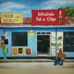
Soweto Fish & Chips

A trip to Soweto in 2014 (in Johannesburg) provided the perfect opportunity to collect subject matter to paint.  Soweto is a rich environment where you can find a work of art in the making behind every turn.  My husband, a friend of ours from the UK and I spent a morning on a formal tour taking pictures of everything.  Here’s the finished painting:

Finished painting website

Finished painting

Back in the studio, I poured over the 338 pictures that we took that morning.  I decided to combine the following photo’s:

  1. A picture of Inthuthuka Fish & Chips – a shop close to Walter Sisulu’s house;
  2. A man sitting on a rock on the side of the road – we took a picture of him from our bus;  and
  3. A car guard smoking a cigarette.

I compiled the photos on PowerPoint and started by drawing a grid.  I drew the picture onto the canvass with a terracotta pencil (it doesn’t give off on the paint the way that graphite does).

Drawing with pencil

Drawing in pencil

The next step was to “fill in” the major parts of the painting, adding some dimension with darker and lighter areas where possible.  In this step I figure out which colours to use and where I need to change.  I included a different sign (Beauty Salon) at the top to introduce a bit more colour and interest.  It’s crucial to keep the lines straight so that the composition is in balance at the end.

Blocked areas

Main areas blocked in

For the Coca-Cola sign, I painted the writing in grey first so that it would stand out against the white background.  Then I painted the red around it – red is very difficult to paint over once it’s on the canvas.  After the red had dried, I went over the grey with white again.

The next step was to put in the first layer of the two people.  I changed the colours a little bit – the blue jeans to viridian green and the red t-shirt to orange to bring in contrast to the painting.  With the first layer I already put in definition (dark and light) taking care not to go too light, because the highlights would be the last step.

I also saw that the top line of the roof wasn’t quite right – the left side was much lower than the right side (thanks, Carien for pointing it out!) and I fixed that as well.

During the next painting session, I added another layer to the sky and put in highlights for the clouds – I used Prussian Blue and white.  When this is dry, I’ll add shadows with Payne’s Gray.  I went over the yellow sign with Yellow Ochre as a second layer, and fixed the line of the roof.  I then put in the highlights on the Coca-Cola bottle using Yellow Ochre, Burnt Sienna and white and lastly went over the white writing with pure Titanium white.  I filled in the notice board in one colour (Burnt Umber with White) and then put in the details of the posters next to the door.  The last step for this session was to paint the pictures of the burger and chips, dagwood and whatever that top picture is!  I’ll wait for it to dry before I put in the red for the ketchup.

Details on signs and people

Some building detail added

Next I started adding the details – the writing of the Beauty sign, the posters on the wall and the black board writing.  I dry brushed the “blackboard” with white to make it look like the chalk writing had been rubbed out.  I also used dry-brush techniques to create the inside of the shop by adding some fridges, sacks of flour and flourescent lights.

Posters and inside

Detail on the posters and the people added

The next step was to put in the burglar bars in front of the two windows.  I cheated a bit…I used masking take to get the bars equal and painted them over with white.

I added the details of the posters as well.  When I looked at the painting, the ground looked too light and the porch too dark, so I changed it around.  I also darkened the shadows that the signs threw on the roof because the photo was taken close to midday and the shadows (although not visible in the photograph) would be more pronounced.

Burglar bars

Burglar bars added

The customer requested to, instead of the window (which I must admit, looked a bit overpowering) include a copy of a beer brand.  I included a Carling Black Label wall sign, and thought that it came out quite well.  It actually became quite the focus point of the painting.


Shela’s portrait

My domestic has been working for me for 8 years. She is 30 years old, with 2 children and runs my household like a professional! Not only is Shela a pleasure to have around, with a great sense of humour and a work ethic that is second to none, she is also quite beautiful. She has been watching my foray into art during the last year with a lot of interest. About 2 months ago she was standing in the studio (read: a corner of the study that my husband allows me some space to paint) looking at my latest endeavour when she said: “Mammi, you must paint me a picture.” “What would you like me to paint for you, Shela?” I asked, thinking that she’ll ask for a nature scene or maybe a painting of the ocean. “Me!” she exclaimed with a bright smile.

Well, I jumped at the opportunity to do a portrait. In fact, that was exactly what I had planned for my next project and Shela was the perfect model. We arranged for her to come through the next day, all dressed up for a photoshoot, and shot pictures of her in the garden, in the lounge on the couch, standing at the front door. She was brilliant! We finally chose a picture from the garden with her staring wistfully into the distance, face at ¾ angle to the camera. The light was great and I thought the picture made her look regal.

Original photo taken in the garden

I printed the photo on good quality paper and printed a black and white transparency as well. The canvas I used was 20 x 30 inches. I traced the picture onto the canvas with graphite using the transparency and overhead projector to ensure that the dimensions were correct. The next step was to get the first layer of paint on. I used a combination of Van Dyke Brown and Burnt Sienna to cover most of the face. At first I tried the Zelco brand, but the Burnt Sienna was too “runny” – almost watery – and it didn’t cover well. My teacher suggested the “Louvre” brand, which worked a lot better. During this layer, I focused on getting the light patches and dark shadows in so that the form of the face could take shape.

First layer in Burnt Sienna and Van Dyke Brown, lots of turps


After this layer dried (which it did within in a week) I filled in the irises in Van Dyke Brown surrounded by a black ring in Lamp Black. I also put another layer of Burnt Sienna and Van Dyke Brown onto the skin so that the canvas was covered well. Then I started on the clothes. I wanted to have quite a contrast between the skin (having a smooth texture) and the clothes, which I did very roughly. I used the red and blue from the photo, but didn’t blend it in at all, trying to get a rough finish where the brushstrokes could still be seen. I used colours that didn’t necessarily show up in the photo, like orange, purple and green, to create interest. The shadows and highlights were quite pronounced. I was very happy with the outcome and it went quite quickly.

Second layer over skin, clothes added

When this dried, I started on the background. A green would make a nice contrast and let the face stand out more. On second thought the green that I chose was a bit bright and started detracting from the portrait. Time to fix it later.

Background added - still wet!

The next step was to focus on the details of the face. I ensured that the skin was blended smoothly and focused on getting the shape of the nose right. With the many layers I had painted over the nostrils and it was imperative to get them right. The details are what makes a person look unique – the way that we recognise someone. I used a combination of Burnt Sienna and Flesh together with Van Dyke Brown. I found that the eyes and irises were too large (if you’re unsure, take a picture and look at the picture on your phone or camera. It usually shows the mistakes easier). I painted the eyes smaller and ensured that the irises were the correct size. The white of the eyes were done with a light grey, and I put in the shadow created by the eye lid. The pronounced shadows on the eyelid, under the eyes and next to the mouth, were done in Lamp Black and blended with Burnt Sienna. The lips were quite dark with a glint of pink. I used Van Dyke Brown and Naphtol Red, Titanium White and Burnt Sienna to get the pink shade right. Sometimes I also used Flesh to lighten the tint. The lips had to be blended quite well with a couple of layers to get it just right. The teeth were done in light grey (never white!) and the gap between the front teeth is a tiny black line. The highlights on the teeth were done with white. The highlights on the skin was also done with white, but blended very well into the rest of the tone. Where the white was too pronounced, I used Burnt Sienna to blend it in. The eyelashes and brows were done in Lamp Black, but when the brows looked too pronounced, I used Burnt Sienna to soften it. Also, be careful of not making the lashes too big or it will look unnatural. I painted a pupil in the eyes although it’s not visible in the photograph, but sometimes, for the sake of reality, you have to paint what’s not there. I also included Burnt Sienna in the irises to ensure that the eyes don’t look dead. Lastly, I added highlights to the eyes and that really brought them to life.

Highlights and shadows added, check the sparkle in the eyes!

Finally the mouth had to be finished. I took care to ensure that after the teeth were painted, the lines of the top- and bottom lips were painted over it. Otherwise it looks like the teeth are protruding from the mouth – not a pretty sight! The earring was done with Cadmium Yellow and grey with white to highlight the reflection. The background was re-done in a dirty green but still kept some of the light green from the first layer to give it depth and interest.

Shela's finished portrait

When I presented Shela with her portrait, she was stunned! Although I had shown her the progress (I was too excited to keep it to myself!) I don’t think she expected the finished portrait to be so beautiful. We will frame it with a simple wooden frame and she has assured me that it will have a place of honour in her house.

Very proud!